Promotional Button Use (Page 4 of 5)


Welcome to our Promotional Button Use category! This is Page 4 of 5 of Promotional Button Use related content. Below you will find articles, posts, coupons or samples featuring Promotional Button Use. To see our latest posts, visit Blog Home.
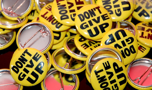
Here is a great example of a 1 inch button being used to its fullest potential. Notice the clean bold font. This helps make this small 1 inch round button stand out. This is a great example of making a small but, mighty button turn into a great promotional button.
Last Modified: August 13th, 2008
First, I’d like to say I’ve seen a lot of great looking buttons over the years but, I’ve also seen some of the worst looking buttons over the course of time as well. Which is what struck me to create a post to help everyone create more successful buttons. Let’s face it, the better your buttons look the happier you will be and the more buttons you will sell!
– Less is more
I remember my art teacher back in high school always telling me that when you are working with small spaces “Less is always more”. I’ve included an example of a good promotional button below for you to see.
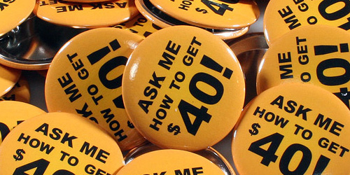
– Keep things short and sweet. (when it comes to text)
When using text, make sure the design flows. You wouldn’t want to have, on one line or even two lines ie. “ASK ME HOW TO GET FREE GAS” (Examples below). This would be using the space of the button poorly. Therefore, making your promotional button look undesirable. The idea of your promotional button is to spark conversation about the message you’d like to convey. (To draw in your customers and to ask a question about what message is on your pinback button).
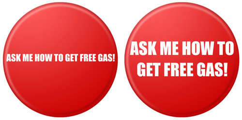
Above, are a few poor examples of a promotional button
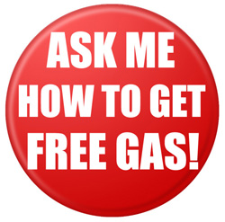
Here is how I would have laid this pinback button out. Notice how much more legible this is. Also, the worth of this pinback button was improved by simply repositioning the text. (see digital mock up below)
– Use colors that flow.
Sometimes colors look great together on your monitor but, let’s face it sometimes when they print it makes the button extremely difficult to read. A rule a thumb I always tell our customers (when they ask me how there button(s) will look) I have them print their artwork out of there home or office printer. That way they can see if things are legible and the colors are what they are looking for.
– When using a smaller button try to keep the design detail to a minimum. As you can see in the example below this is a highly detailed button design, but also notice there is no text. If there was text on this, it would make it extremely difficult to read.
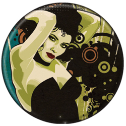
– Be sure to have a full bleed for your design. I believe pinback buttons that have a full bleed look better and have higher quality value to them. I would highly suggest always designing your buttons with a full bleed.
These simple tips will help your pinback buttons be more successful, and you will also be happier with your button order.
Last Modified: August 4th, 2008
When the economy is having difficulties, many things change. Some recent examples of businesses changing to stay competitive is Ford, announcing that they will produce less trucks and SUVs to manufacture more small cars. In marketing and advertising, for example, you see PPC campaigns taking a hit. Google and Yahoo both failed to meet investor expectations and their stocks went down. Buttons, however, have grown exponentially during this state of the economy. As a company, we have noticed a lot of companies, big and small, placing more and larger orders for buttons. Interestingly enough, we have seen a dramatic growth in inquiries from marketing and merchandising companies interested in promotional buttons and advertising buttons. Record labels, as well, seem to be placing larger orders for band buttons. Campaign buttons are also extremely popular this time of year.
To confirm this theory, we were talking with our parts supplier, and they have also experienced enormous growth. What does all this mean? In a state of economic uncertainty, companies and record labels look for a cheaper, more effective way to promote or advertise. Another reason, is companies want to conserve as much as possible to stay competitive, in case of continued economic uncertainty.
Lessons to take away from this period in time. Custom Buttons are the cheapest and most effective form of advertising. Band buttons are the best selling band merch. More people are willing to pay $5 for some band buttons than $25 for a t-shirt. Even better, for bands, band button packs. Also, button packs are great tools for a promotional.
Last Modified: July 31st, 2008
The Penny Arcade Expo (PAX) is an annual gamer festival held in Washington state, USA. PAX was created by Jerry Holkins and Mike Krahulik, the authors of the Penny Arcadewebcomic, because they wanted to attend a show that gave equal attention to console gamers, computer gamers, and tabletop gamers. No such show existed, so PAX was born.
Created in 2004, PAX has nearly doubled in size each successive year and has been hailed as a weekend-long celebration of gamer culture. Defining characteristics include an insider keynote speech, game-inspired concerts, panels on game industry topics, exhibitor booths, after-hours parties, tournaments, and freeplay areas. (thanks Wikipedia for this burst of content)
Furthermore, for this years show, they have decided to use buttons for identification. Here’s an exerpt from the forum:
Alright, here’s the idea guys. We need a form of identification for forumers at PAX. As Moe has suggested, custom made buttons with our name/avatar or whatever would be a great option, but to extend this idea and make it more Penny Arcade-ish I suggest that each get a bunch of buttons and trade one for one when we meet each other. Thus making it a game of “gotta catch them all”.
They continue:
Where do I get buttons from?:
PureButtons – Pure Win!
When purchasing, use coupon code “Winter0708” for 15% off!* Custom 1″ button 50-pack: $10.00
* Custom 1.25″ button 50-pack: $12.50
* Custom 1.5″ button 50-pack: $14.00 *Most preferred size among Arcadians.
* Custom 2.25″ button 50-pack: $21.00
We thought this was pretty cool, a button trading game. It makes us reminiscent of pogs. The PAX Buttoneers are all about custom buttons, but all of our products are all excellent candidates for trade show giveaways.
Last Modified: July 30th, 2008
This post will be the final edition of our promotional buttons series. Everyone loves buttons, no doubt about it. This post will help you get the most out of those promotional buttons that everyone loves. First thing, think about who you are targeting. This is a very important step, that many look over and don’t give enough credit to. You need to put yourself in their position. In you ideal customer, what do they like? How much money do they make? What gets them excited? These are all very important questions, that you must consider before you start designing.
Now, that we have established and have clear understanding of what our ideal customer might be interested in, lets start desigining. It does not matter too much what you design, as long as it is something that will appeal to your ideal customer, you are golden. However, there are some things to keep in mind. Buttons are small, so you promotional buttons main goal, should be to grab attention. Once attention has been grabbed, it needs to convey a message. A good message is something that will puzzle your customer, or be witty enough that they will want to ask quesitons. In our earlier post, some good examples of promotional buttons, you can see some great examples.
Everyone loves buttons indeed, so why not make your promotional buttons a success. It all starts will a well thought out design.
Last Modified: July 22nd, 2008