4 tips for designing a successful promotional button

First, I’d like to say I’ve seen a lot of great looking buttons over the years but, I’ve also seen some of the worst looking buttons over the course of time as well. Which is what struck me to create a post to help everyone create more successful buttons. Let’s face it, the better your buttons look the happier you will be and the more buttons you will sell!
– Less is more
I remember my art teacher back in high school always telling me that when you are working with small spaces “Less is always more”. I’ve included an example of a good promotional button below for you to see.
– Keep things short and sweet. (when it comes to text)
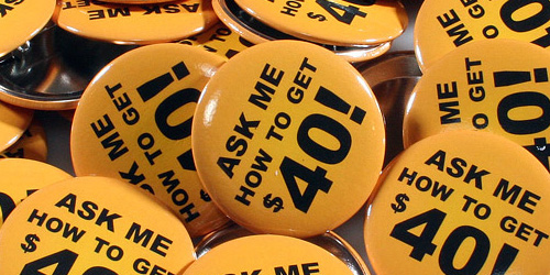
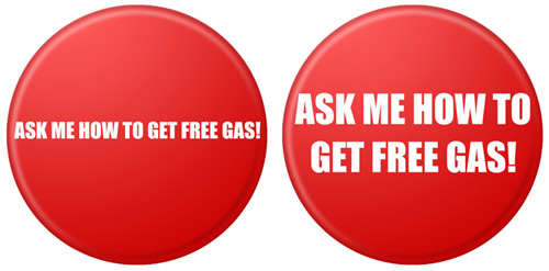
When using text, make sure the design flows. You wouldn’t want to have, on one line or even two lines ie. “ASK ME HOW TO GET FREE GAS” (Examples below). This would be using the space of the button poorly. Therefore, making your promotional button look undesirable. The idea of your promotional button is to spark conversation about the message you’d like to convey. (To draw in your customers and to ask a question about what message is on your pinback button).
Above, are a few poor examples of a promotional button
Here is how I would have laid this pinback button out. Notice how much more legible this is. Also, the worth of this pinback button was improved by simply repositioning the text. (see digital mock up below)

– Use colors that flow.
Sometimes colors look great together on your monitor but, let’s face it sometimes when they print it makes the button extremely difficult to read. A rule a thumb I always tell our customers (when they ask me how there button(s) will look) I have them print their artwork out of there home or office printer. That way they can see if things are legible and the colors are what they are looking for.
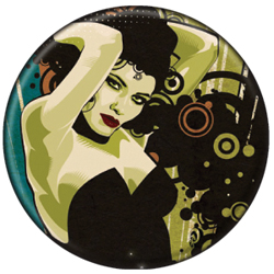
– When using a smaller button try to keep the design detail to a minimum. As you can see in the example below this is a highly detailed button design, but also notice there is no text. If there was text on this, it would make it extremely difficult to read.
– Be sure to have a full bleed for your design. I believe pinback buttons that have a full bleed look better and have higher quality value to them. I would highly suggest always designing your buttons with a full bleed.
These simple tips will help your pinback buttons be more successful, and you will also be happier with your button order.
Last Modified: August 4th, 2008