Custom Buttons Blog (Page 140 of 156)


Welcome to The Button Post by Pure Buttons (Page 140 of 156)! A blog where we discuss all things related to custom pin-back buttons and other custom promotional products that Pure Buttons offers. Stick around for coupons to score cheap pinback buttons, new button product announcements and more!

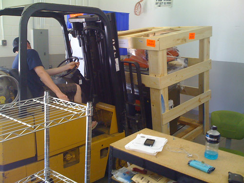
Our new packaging die cutter just arrived! In this photo our warehouse manager is placing the die cutter into place before the electrician arrives. This will help us output a higher quality backer card for all of our button packaging. This new die cutter will help us produce your backer cards even faster!
To find more about our packaging visit our custom button packaging page.
Last Modified: July 16th, 2009

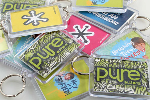
We are now offering Acrylic Keychains at the most affordable rates! Visit our Custom Key Chain page. Many more photos coming soon!
Last Modified: July 16th, 2009
My name is Josh, and i play in a band called Sail by the Stars, and we were recently ordering merch for an upcoming tour. We decided to print a bunch of 1″ buttons to sell. One of our members had worked with Pure Buttons in the past but after seeing their extremely inexpensive prices, i was a little hesitant to work with the company. We decided to go ahead and place the order through them anyways. There was a technical problem with uploading art files/placing an order through their site, but their customer service was fantastic at handling the problem, and i had my order placed in no time. We were on somewhat of a deadline to get the buttons, i notified them of it, and guess what? Unlike a lot of companies that would have missed the deadline, or even come in at the last second and got the order to us the day we needed it, Pure Buttons had it to us TWO DAYS EARLY. They look fantastic. We were so pleased working with them, and will definitely work with them again in the future. They provide a great product, at an even better price, while maintaining fantastic customer service. Thank you, Pure Buttons.
-Josh Koterba
Sail by the Stars
Last Modified: June 12th, 2009
We’ve just launched our new site and are proud to announce that we now have a full line of Promotional Products.
We are now offering the following Promotional Products:
> Custom Magnets
> Custom Pocket Mirrors
> Custom Zipper Pulls
> Custom Acrylic KeyChains
> Custom Button Packaging
We are now offering 4 NEW button sizes! The following new sizes are: 1.75″ Round Buttons, 3″ Round Buttons, 1.5″ Square Buttons, 1.75″ x 2.75″ Rectangle Buttons & 1.75″ x 2.75″ Oval Buttons.
Be sure to check out our new site. We are now your source for Custom Buttons & Custom Promotional Products.
Visit us @ PureButtons.com
Last Modified: March 3rd, 2026
Just a note to say THANK YOU for such great customer service and most of all for making some really awesome looking buttons for our event! They came out great as usual.
Also, congratulations on your new website which I heard about via your tweet on twitter. We’d love to be featured as a happy customer on your site one day.
Thanks again for your great service and products! We look forward to our next batch of buttons soon.
aloha!
\scott\
Last Modified: June 4th, 2009