How To’s (Page 3 of 4)

Welcome to our How To’s category! This is Page 3 of 4 of How To’s related content. Below you will find articles, posts, coupons or samples featuring How To’s. To see our latest posts, visit Blog Home.
What do the two lines in our templates mean?
Inner Dashed Circle – This is the “live area” or the “face” of the button. You’ll want to keep all important artwork & text inside this circle. Anything outside of the dashed circle will fold over the edge and wrap around the button. *please remember that when using our templates.*
Outer Solid Line – The outer solid line is our cut line. Anything outside of this line will be deleted.
As you can see on the right of this image there is a digital proof of the templated artwork on the left. You’ll notice on the left that the important artwork is left inside the dashed circle.
If you are unsure and would like to see a digital proof of your button. Please select “Need digital proof” when placing your order on Step 2 of our order process. This will help ensure the accuracy of your button.
Last Modified: October 1st, 2009
First, I’d like to say I’ve seen a lot of great looking buttons over the years but, I’ve also seen some of the worst looking buttons over the course of time as well. Which is what struck me to create a post to help everyone create more successful buttons. Let’s face it, the better your buttons look the happier you will be and the more buttons you will sell!
– Less is more
I remember my art teacher back in high school always telling me that when you are working with small spaces “Less is always more”. I’ve included an example of a good promotional button below for you to see.
– Keep things short and sweet. (when it comes to text)
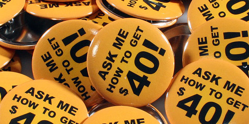
When using text, make sure the design flows. You wouldn’t want to have, on one line or even two lines ie. “ASK ME HOW TO GET FREE GAS” (Examples below). This would be using the space of the button poorly. Therefore, making your promotional button look undesirable. The idea of your promotional button is to spark conversation about the message you’d like to convey. (To draw in your customers and to ask a question about what message is on your pinback button).

Above, are a few poor examples of a promotional button
Here is how I would have laid this pinback button out. Notice how much more legible this is. Also, the worth of this pinback button was improved by simply repositioning the text. (see digital mock up below)

– Use colors that flow.
Sometimes colors look great together on your monitor but, let’s face it sometimes when they print it makes the button extremely difficult to read. A rule a thumb I always tell our customers (when they ask me how there button(s) will look) I have them print their artwork out of there home or office printer. That way they can see if things are legible and the colors are what they are looking for.
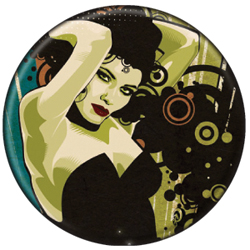
– When using a smaller button try to keep the design detail to a minimum. As you can see in the example below this is a highly detailed button design, but also notice there is no text. If there was text on this, it would make it extremely difficult to read.
– Be sure to have a full bleed for your design. I believe pinback buttons that have a full bleed look better and have higher quality value to them. I would highly suggest always designing your buttons with a full bleed.
These simple tips will help your pinback buttons be more successful, and you will also be happier with your button order.
Last Modified: August 4th, 2008
Aaron, Thanks for taking the time to give some 411 on this. Take it away.
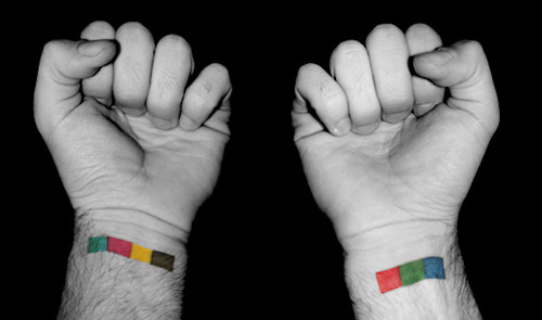
The first thing I tell all my designers and/or interns is to run out and have both RGB and CMYK tattooed on each wrist for quick, fool-proof referencing. Serious, no just kidding, but our friend and fellow designer Andy Huff happens to have this sweet ink which makes for a blog-style perfect joke.
Last Modified: July 24th, 2008
The customer is king/queen. We have all heard this before. It’s up to you, our customer, to prove it so. With these five tips you will be a lot closer to proving that you are on top of industry trends and technologies for the button packaging industry.
1) Understand your customers. The problem today is that one package may not satisfy the needs and requirements of all your customers. There are numerous niche markets out there that require specialized packaging. So if you are targeting one of these niche markets, we recommend you do your research first. What works for one target market may not work for another.
2) Find out what button package attributes appeal to the customers you are targeting. If it’s the high school kid that is into your band, make sure your package employs the characteristics that appeal to your target market.
3) Understand how your button packs will be used. This is important! Will your customers view this as a gateway to purchase more products or will this be all they purchase? The idea behind this is for your button packs to be a gateway purchase. We want your customers to buy more based on what they see. Button packs are a great way to help achieve this standard.
4) Know what your customers want. This is extremely important. Sometimes it might take that bit of extra pocket change to have a designer come up with a great looking button pack. Weigh these costs about before going about it though. Throw some rough numbers together on how many more button packs you think you’ll sell because of the design. This could be more then you think. Remember a lot of times these are “gateway” products. These will help bring in customers to spend more money. Example: A friend buys a cool button over at Hot Topic (TM) and I see it and say to myself “I have to have that button”. I then go to Hot Topic (TM) looking for that button and stumble upon some other things that interest me. Now, I went into the store only to purchase a $1.75 item and ended up spending $50.00 in the store because I found a couple of other items I found interesting.
5) Stay tuned into our site for our new button packaging options. We continuously offer creative new products that have the advantage in the marketing world. Several years ago PureButtons took the button industry by storm. Now we’d like to continue to do the same which is why we are offering our new retail ready button packaging. Please look for innovative ways to combine our button packaging with other custom merch options.
A quick note, the customer depends upon you, the provider, as a resource. They expect you to keep up with packaging trends and provide the latest and greatest designs.
We look forward to seeing what you can come up with. Any new unique packaging ideas we see from our customers we will post here on our blog. Check back often!
Be sure to check out our Custom Button Packaging page.
Last Modified: July 9th, 2008
Step 1. – Printing the artwork. This step requires downloading the artwork from our CMS (customer management system), then fixing up the artwork to our exact specifications.
Step 3. – Die Cutting the artwork.
Step 4. – Assembling the button with our button machine.
– first, you will insert a button blank called a shell into the larger cavity.
– Second, you will place the die cut circle on top of the shell.
– Third, you will now place a metal ring called a collet into the next cavity
This is a step and repeat process.
– Fifth step, let the machine do the work. What happens now is the machine will actually pick up the mylar, artwork and shell and fold the artwork under the lip of the shell. Then, the collet will then be pressed into the shell. The collet is what fuses the two together. (holding the button together)
The machines arm has a magnet at the end of it and its now picking the button out of the machine.
Step 5. – We will insert the pin into the back of the button.
Step 6. – Finally the button is complete! You are now ready to wear your finished button. (In This case I’ve showed you our pin back button option as well as our zipper pull buttons)
Last Modified: March 3rd, 2026