24
Jul
2008
Have you ever created your artwork in RGB color mode for the web and then needed convert it into CMYK color mode for your next print run and notice the colors change? I’ve asked Aaron Belyea from Alphabet Arm to explain this and to give his recommendations for designing your next project.
Aaron, Thanks for taking the time to give some 411 on this. Take it away.
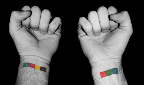
The first thing I tell all my designers and/or interns is to run out and have both RGB and CMYK tattooed on each wrist for quick, fool-proof referencing. Serious, no just kidding, but our friend and fellow designer Andy Huff happens to have this sweet ink which makes for a blog-style perfect joke.

In all seriousness, we’d recommend working in a CMYK format whenever possible (any designer worth their weight in buttons should know how to set up their documents within Illustrator or Photoshop from the get-go. If you are unclear how to do this, we’d recommend hiring a designer/studio for the whole project). That said, we can offer a couple of tricks of the trade. First, we do like to set up our artwork using Pantone (Solid to Process) colors that have a smooth transitions to CMYK. That way, you have a physical version of the color that you are aiming to use for production. The other nugget of knowledge would be, when exporting Illustrator files to Photoshop, we found that exporting as RGB tends to have a better color ratio than Illustrator’s default CMYK export. For some reason, the CMYK export reinterprets 100% black differently each time. So, we’ll export as RGB, then convert to CMYK in Photoshop, and color correct as need be.
Last Modified: July 24th, 2008


